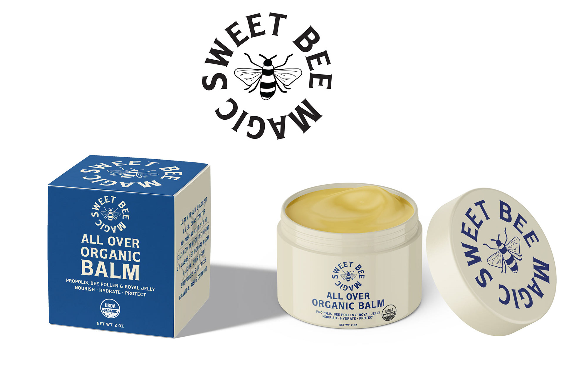
- Use the DARK BLUE Color from #2 in combination with a WHITE and/or YELLOW / HONEY color font (gold color from #3 will not work on the shelf)
- Let's try a honey / yellow color that will be readable, help the label to "pop" and so forth.
JAR
- Given the box will be mainly blue, let's try the jar with white / cream color (as in the current #3 design)
- Also try a jar with the blue color from #2 - and perhaps a honey color for the lettering and / or white lettering
BOX
- Front and Top of Box, let's make it blue from #2
- Sides and bottom of box, let's make white with the blue color lettering
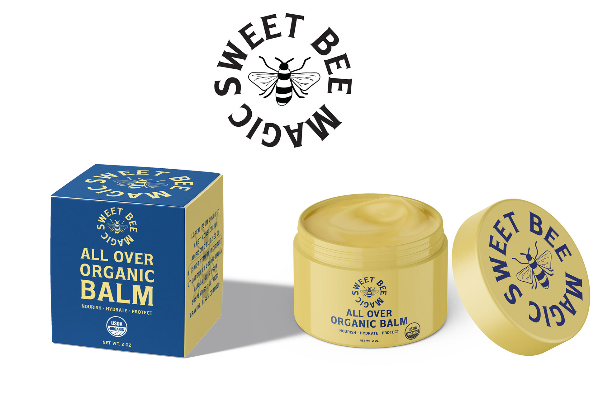
Blue from R1 #2 (FOLK) + softer yellow letting and yellow jar. No ingredient callouts.

Blue from R1 #2 (FOLK) + white letting and white jar. No ingredient callouts.